Are you tired of monochromatic table settings that lack personality? Do you dream of creating a dining experience that feels curated, unique, and bursting with character? The secret lies in mastering the art of mixing and matching dinnerware colors. Moving beyond traditional matching sets opens a world of creative possibilities, allowing you to express your individual style and transform any meal into a special occasion. This guide will help you confidently combine colors, patterns, and textures to design a tablescape that truly shines.
Why Embrace the Mix-and-Match Trend?
Embracing the mix-and-match trend for your dinnerware isn’t just about breaking free from convention; it’s about cultivating a dining environment that is dynamic, inviting, and uniquely yours. It allows you to express individuality and imbue your table with a sense of personal history and curated style. Rather than being confined to a single collection, you can utilize existing beloved pieces alongside new finds, creating a table that tells a story and feels authentically collected over time. This approach also makes your dinnerware more versatile, adaptable for different seasons, occasions, and moods, proving that a cohesive look doesn’t always mean perfectly matching sets.
The Foundation: Understanding Color Theory for Dinnerware
To confidently mix and match dinnerware colors, a basic understanding of color theory can be incredibly helpful. It provides a framework for creating harmonious or exciting combinations.
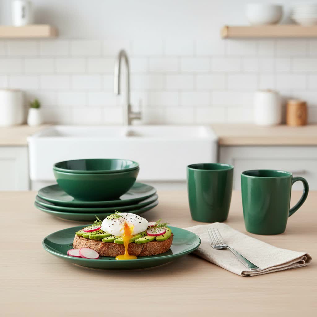
- Monochromatic Schemes: This approach involves using various shades, tints, and tones of a single color. For example, a setting could feature plates in light blue, indigo, and deep navy, creating a sophisticated and calming effect with subtle visual interest.
- Complementary Colors: These are colors directly opposite each other on the color wheel, such as blue and orange or red and green. When used together, they create a high-contrast, vibrant, and energetic look that immediately grabs attention.
- Analogous Colors: Found next to each other on the color wheel, analogous colors share a common hue, resulting in harmonious and serene combinations. Think of combining shades of blue, green, and teal for a tranquil, nature-inspired tablescape.
- Neutral Base: White, cream, gray, or even black serve as powerful neutral foundations. They provide a calm canvas that allows more vibrant or patterned accent pieces to truly pop without overwhelming the eye.
Key Strategies for Mixing and Matching Dinnerware Colors
Creating a beautifully mismatched table setting involves thoughtful layering and a few expert strategies.
1. Establish a Dominant Color Palette
Table is empty.One of the most effective ways to achieve a cohesive look when mixing different dinnerware pieces is to establish a dominant color palette. Choose one to two primary colors that will anchor your tablescape, then incorporate coordinating shades and accent colors. For instance, you might start with deep navy dinner plates, layer crisp white salad plates, and add gold accents for a regal yet modern contrast. The key is to ensure there’s a common color accent or theme that ties all the pieces together, even if their patterns or styles differ significantly.
2. The Power of a Neutral Base
If you’re new to mixing and matching, starting with a neutral base is an easy and foolproof method. Plain white or cream dinner plates provide a clean, versatile canvas that allows you to experiment with more colorful or boldly patterned salad plates, dessert plates, or bowls. This simple foundation ensures that the overall look remains elegant and balanced, preventing the table from appearing too busy. A neutral base offers flexibility, allowing you to effortlessly change your accent pieces to suit different occasions or seasons.
3. Blend Patterns with a Unified Color Theme
Mixing patterns can add immense visual interest, but it requires a strategic approach to maintain harmony. When combining different patterns—such as florals, stripes, geometric prints, or abstract designs—it’s crucial that they share at least one common color. For example, a floral plate could be beautifully paired with a striped plate that incorporates some of the same hues found in the flowers. Subtle patterns are generally easier to mix than very bold ones, as they tend to be less overwhelming and allow for more intricate layering.
4. Incorporate a Variety of Textures
Texture adds depth and sensory appeal to your tablescape, making it feel more luxurious and thoughtfully designed. Mix and match dinnerware materials like glossy porcelain with textured stoneware or matte-finish ceramics. You can pair a sleek porcelain dinner plate with a hand-thrown ceramic bowl to balance elegance with rustic charm. Beyond the dinnerware itself, consider integrating textures through placemats made of woven materials, linen napkins, or even wooden serving boards to enhance the overall tactile experience.
5. Experiment with Different Shapes
Don’t be afraid to combine different shapes to create a dynamic and visually intriguing table setting. Instead of sticking to all round plates, try layering square dinner plates with round salad plates or oval serving dishes. The contrast in shapes adds an artistic flair and breaks the monotony of uniform dinnerware. To maintain cohesion when mixing shapes, it’s often best to stick to a unified color palette or material, allowing the form to be the primary element of variation.
6. Merge Contemporary and Vintage Elements
Bringing together modern dinnerware with cherished vintage or heirloom pieces creates a collected, timeless aesthetic that speaks to personal history and style. An antique floral china plate can be beautifully juxtaposed with a simple, monochrome contemporary design. This blending of eras adds character and depth, giving your table setting a unique story. Look for vintage pieces that share a color or a subtle design element with your modern collection to ensure a harmonious blend rather than a jarring contrast.
Beyond the Plate: Elevating Your Tablescape with Color Accents
A truly professional tablescape extends beyond the dinnerware itself, incorporating other elements to enhance the overall color scheme and theme.
Tablecloths and Linens
Your tablecloth or placemats serve as the backdrop for your dinnerware, playing a crucial role in setting the tone. Use a tablecloth to introduce a dominant color for your setting or to provide a neutral base that allows your colorful plates to stand out. Napkins offer a fantastic opportunity to add a pop of contrasting color, echo a hue from your dinnerware, or tie into a broader theme. For instance, if your plates are blue and white, yellow napkins can provide a cheerful, complementary accent.
Glassware and Cutlery
Consider how your glassware and cutlery contribute to the overall color narrative. For cool-toned dinnerware, such as blues, greys, or blacks, silver cutlery can enhance the sophisticated aesthetic. Conversely, warm-toned dinnerware in reds, oranges, or golden hues pairs beautifully with copper or gold cutlery, infusing a sense of richness. You can also incorporate colored glassware to further enrich your table, choosing pieces that either match or subtly contrast with your dinnerware colors.
Centerpieces and Decor
The centerpiece is the focal point of your table and should complement, not compete with, your dinnerware. Choose flowers, candles, or decorative objects that feature colors coordinating with your chosen palette or provide a thoughtful accent. For example, if you’re using a predominantly blue and white dinnerware scheme, a centerpiece with yellow or coral flowers can introduce a delightful pop of complementary color, creating a lively and balanced visual.
Practical Tips for Success
- Start Small: If you’re new to mixing and matching, begin by introducing just one or two new pieces, such as a set of colorful salad plates, to an existing plain dinnerware set. This allows you to experiment without feeling overwhelmed.
- Trust Your Eye: While color theory offers guidelines, the most important rule is to trust your own aesthetic judgment. If a combination feels right and brings you joy, it’s a success. Don’t be afraid to break traditional “rules” to create something truly personal.
- Consider the Occasion: Tailor your mix-and-match choices to the formality and mood of the event. A vibrant, eclectic mix might be perfect for a casual brunch, while a more subdued, coordinated palette could be ideal for a formal dinner party.
- Embrace Seasonality: Let the seasons inspire your color choices. Pastel hues and delicate florals are wonderful for spring, bright and bold colors for summer, earthy tones for autumn, and deep reds, greens, and golds for winter holidays.
- Don’t Overdo It: While mixing is fun, balance is crucial. Too many colors, patterns, or textures can make a table look cluttered rather than curated. Aim for a harmonious blend where each element enhances the others without creating visual chaos.
Conclusion
Mixing and matching dinnerware colors is a delightful journey into personalized tablescaping, transforming everyday meals into extraordinary experiences. By understanding basic color theory, employing strategic layering, and bravely experimenting with patterns, textures, and shapes, you can curate a table that reflects your unique style and creates an inviting atmosphere for any occasion. It’s about celebrating individuality and turning your dining table into a canvas for your creativity. So, what vibrant color combination will you dare to explore first to bring your table to life?
Frequently Asked Questions
Can I mix different brands of dinnerware?
Absolutely! Mixing different brands is a fantastic way to achieve a unique, curated look. Focus on how the colors, patterns, and textures from different brands complement each other rather than worrying about brand consistency. Many find that combining high-end pieces with more affordable finds creates an intriguing and personalized tablescape.
How many colors should I use when mixing and matching dinnerware?
While there are no strict rules, a good starting point is to limit yourself to two or three main colors. This helps maintain a cohesive and balanced look without overwhelming the eye. You can then use various shades and tones within that chosen palette to add depth and interest.
What if my existing dinnerware is all one color?
Having dinnerware that is all one color, especially a neutral like white, cream, or gray, is an ideal starting point for mixing and matching. Your existing set provides a perfect base layer. You can then easily introduce colorful salad plates, patterned accent bowls, vibrant napkins, or decorative chargers to instantly transform your table.
How do I make mismatched plates look intentional?
To make mismatched plates look intentional, focus on finding commonalities. This could be a shared color, a consistent style (e.g., all rustic or all modern), or even a similar motif. Layering is also key; using a charger plate or a large dinner plate as a unified base for diverse smaller plates helps tie the look together.